Here we'll show how to use Animator (by Haiku) to create a small, practical component — file upload progress bar — and get it running in a real web app.
See the Pen Tutorial 1 by Haiku (@Haiku) on CodePen.
For this tutorial, we'll imagine that you work on a team that is building a web app. The web app has a feature where users can upload a file. And your task is to design the progress bar component.
Let's get started!
Part I: The React App
An engineer has already built the file upload system. She also set up a React app that displays the file upload progress. Although it works well, visually its look and feel could clearly be improved:
Now you, as the designer, will make a component to show the upload progress. The upload progress value (a fraction between 0.0 and 1.0) will drive the length of the progress bar.
To see the code for the unfinished React app, clone the repo and check out the
masterbranch.
Part II: The Sketch Design
Our first step is to use our favorite design tool, Sketch, to draw a decent-looking progress bar component. Here's what our progress bar design elements look like once they are completed in Sketch:
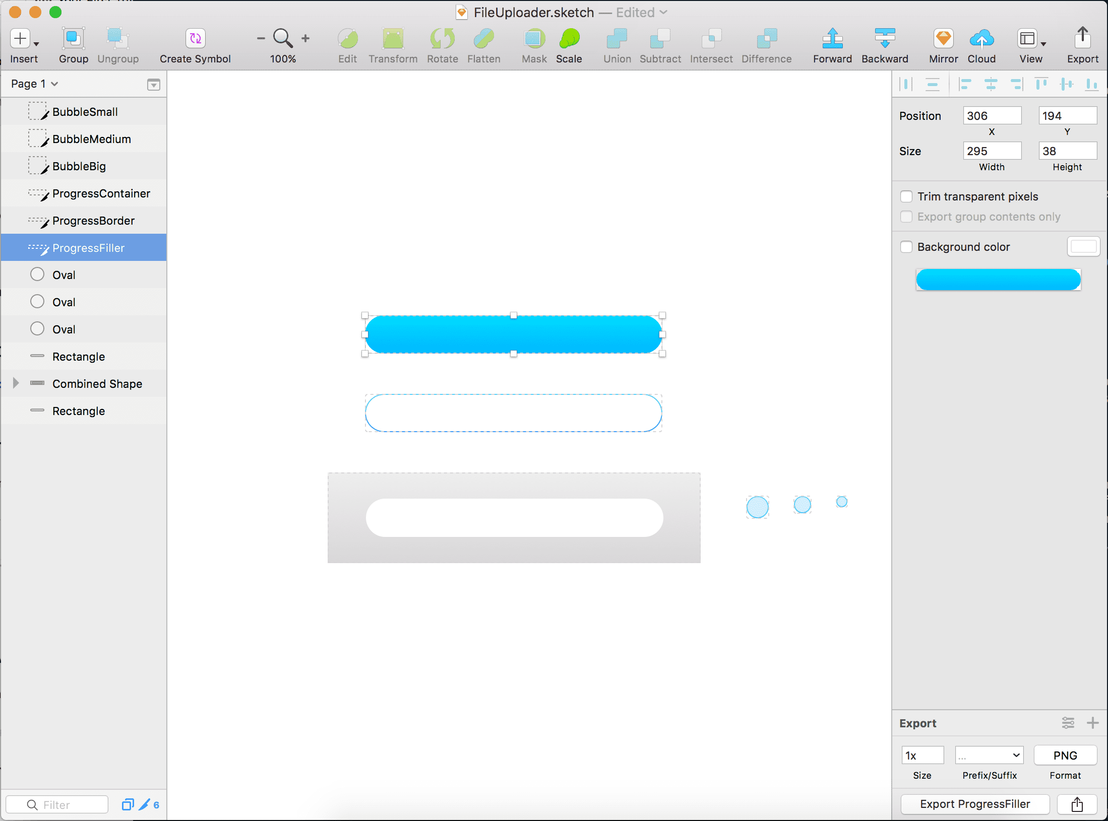
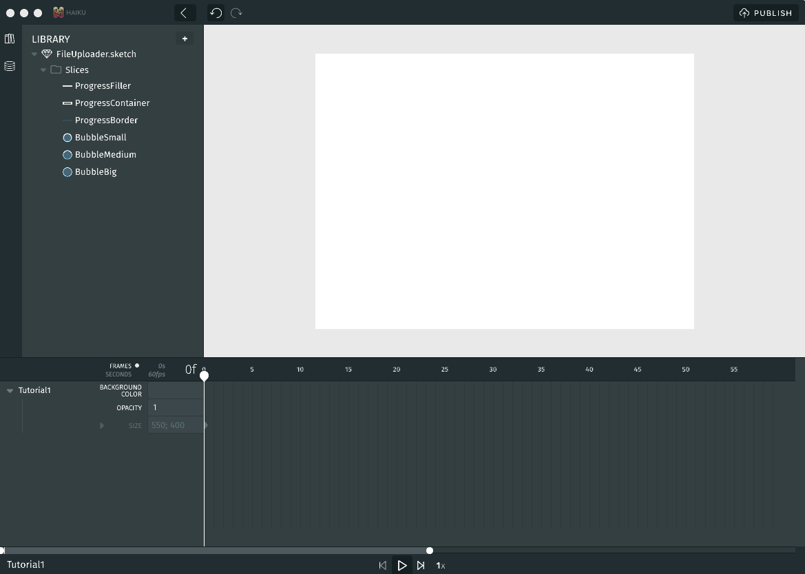
As we create the design, we use Sketch to create slices of each element we might wish to independently animate, and give each one a unique name. We've now got the following slices:
- ProgressContainer - The background element
- ProgressBorder - Some visual trim
- ProgressFiller - The piece that will animate as uploading occurs
- BubbleSmall, BubbleMedium, and BubbleBig - Some visual flair
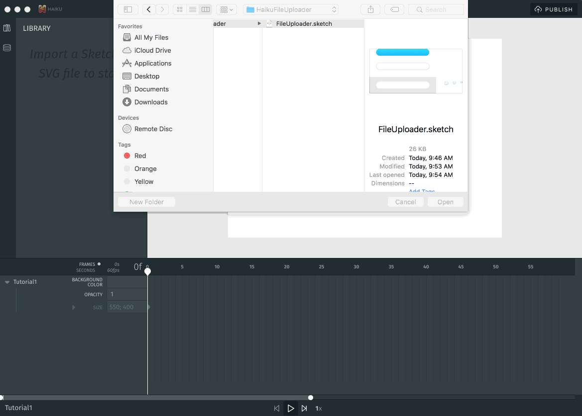
We save our sliced-up Sketch file as FileUploader.sketch somewhere on our file system, and get ready to make it into a dynamic component!
To take a closer look at our design, download the Sketch source file.
Part III: Composing in Animator
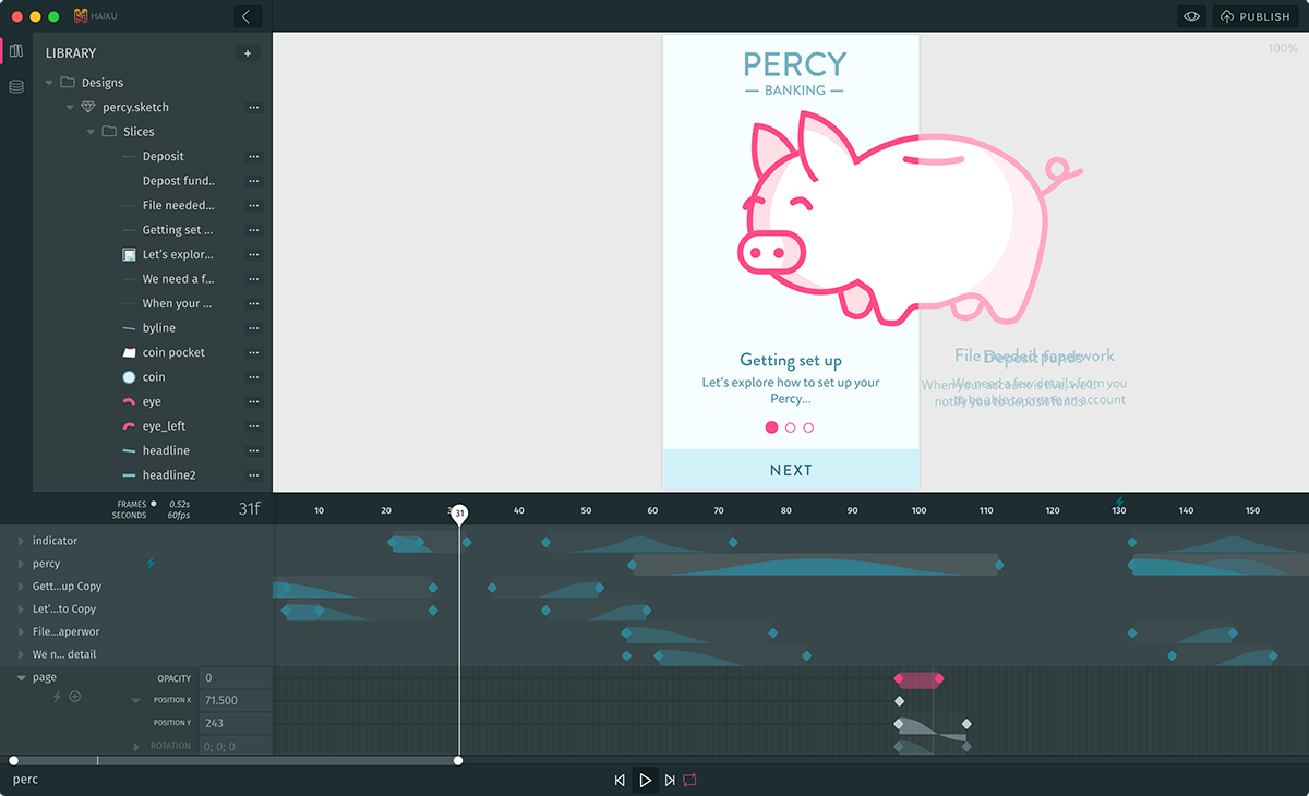
Now it's time to fire up Animator and start composing our animation.
First we import our Sketch file to make the slices available to our scene:
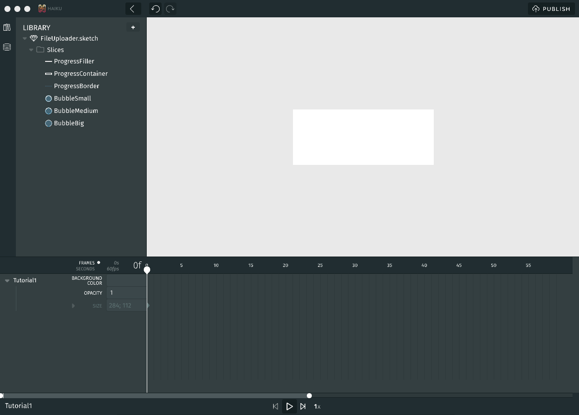
Now we resize the artboard to about the size we want it to be:
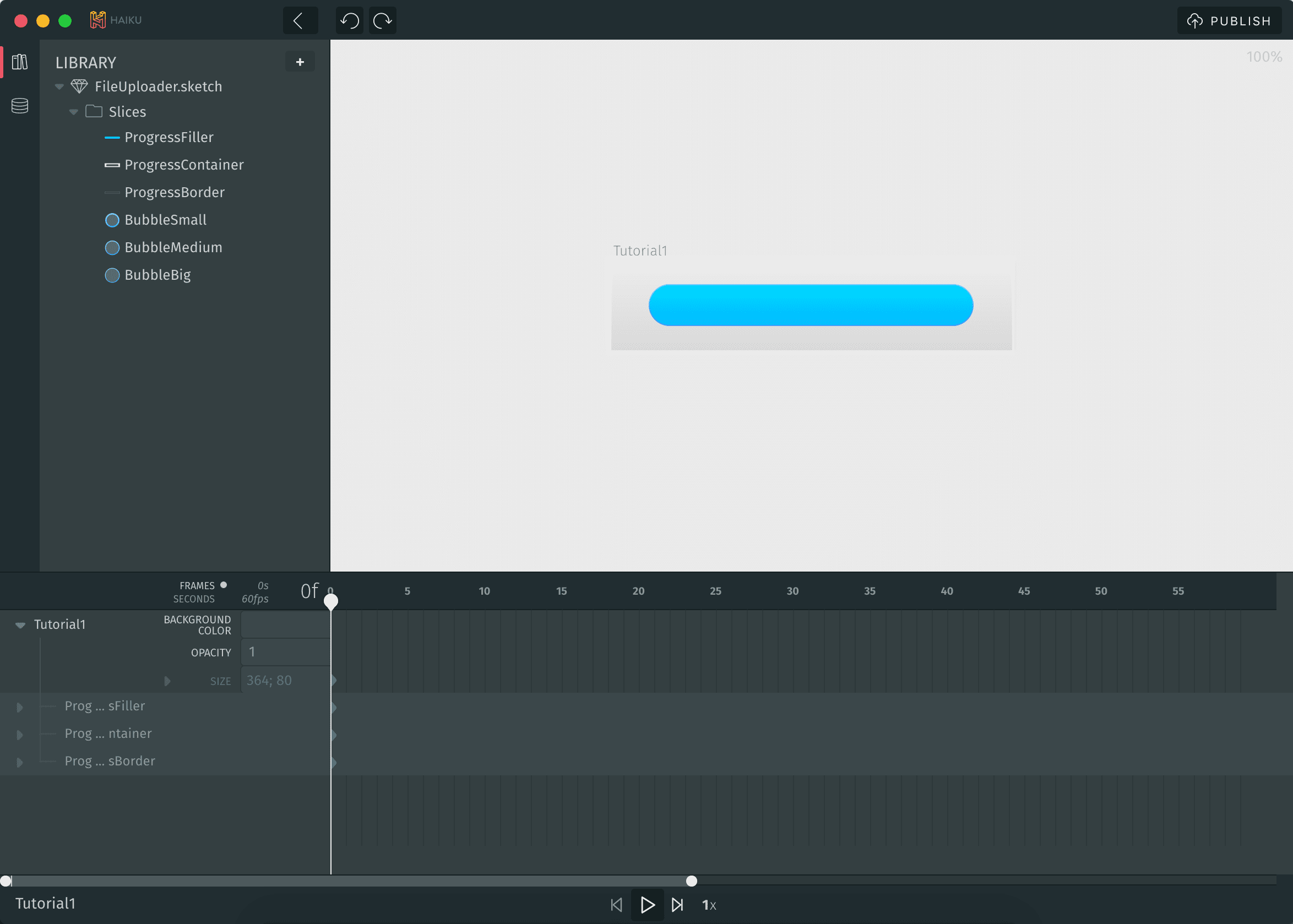
Next we place elements on stage to start composing the scene:
Then we position elements until they are lined up how we want:
For further instruction on these techniques, see our guides on the Stage and the Timeline.
Part IV: Animating in Animator
Let's add some visual flair to the component! We'll place a few of our bubble slices on the stage and animate them using the Timeline.
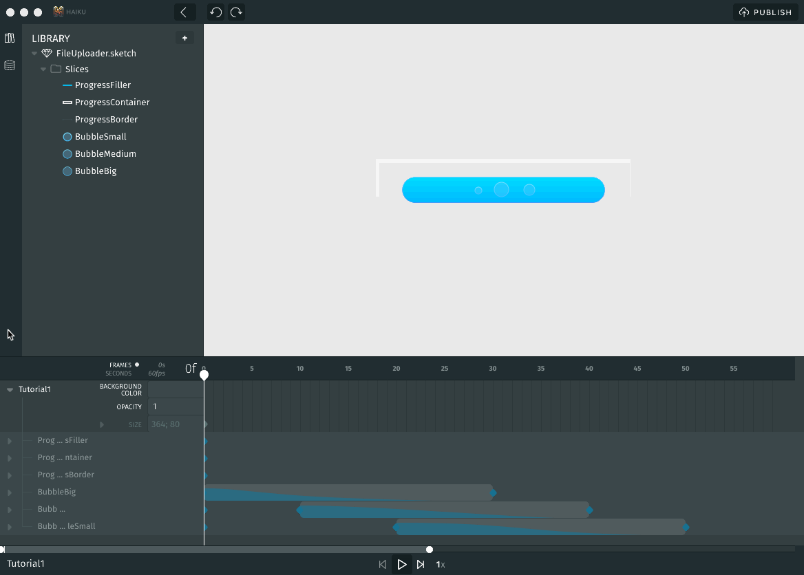
For each of the bubble elements, here are the steps we follow:
- Move the ticker to frame
0. - Place a bubble on stage at the desired start position.
- Move ticker to frame
40(or whatever frame we want the animation to end!). - Move the bubble to the desired end position.
- On the Timeline, between the start and end keyframes, right-click and:
- Choose "Make Tween"
- Choose the desired curve, e.g. "Ease Out > Cubic"
- Press the play button to see the animation.
For more detail on using the Timeline to animate, see the Timeline guide.
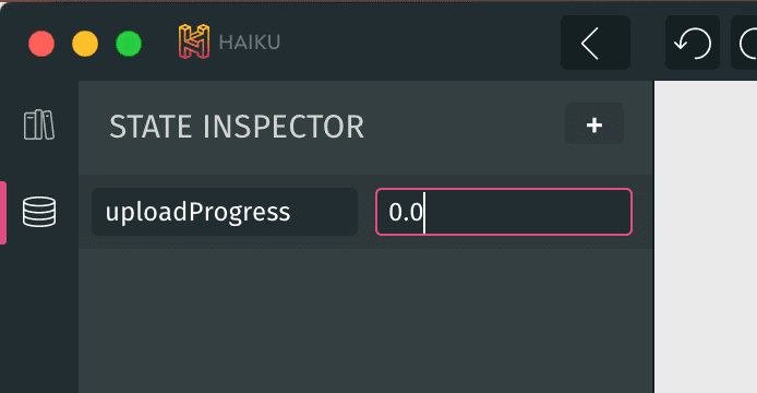
Part V: Dynamic Behavior in Animator
Of course, our progress bar has to be able to respond to changes. To make our component dynamic, we create a state value and then write an expression to link that state to an element's property.
In our case, we'll create a state called uploadProgress:
Then we'll write an expression that links that state value to the X Position of our ProgressFiller element:
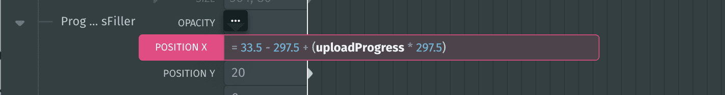
The value
33.5is the position at which we placed the filler element.297.5is the length of the element. Here, what we'll do is move the element to the left (outside of the scene), and then have it enter the scene as a fraction of its length as the upload progress continues.
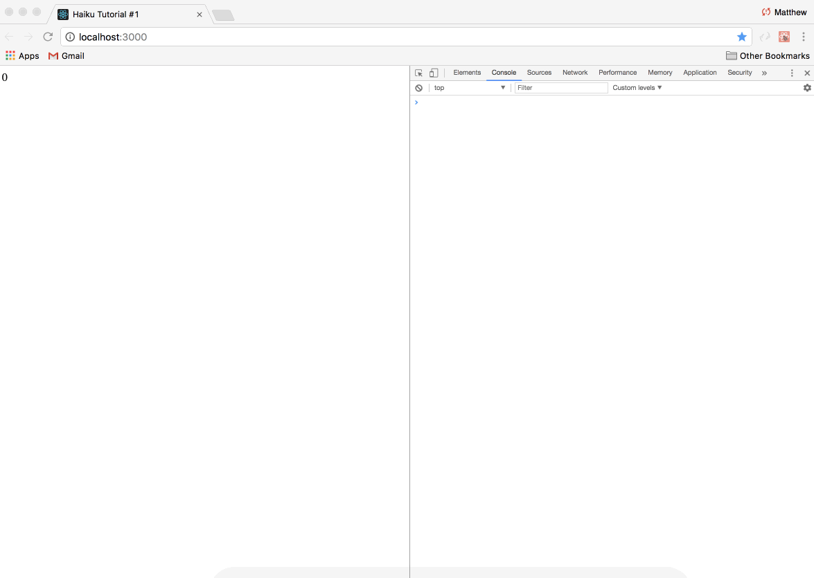
Then we'll verify that our change works by modifying the state value, and watch the change take place on the stage:
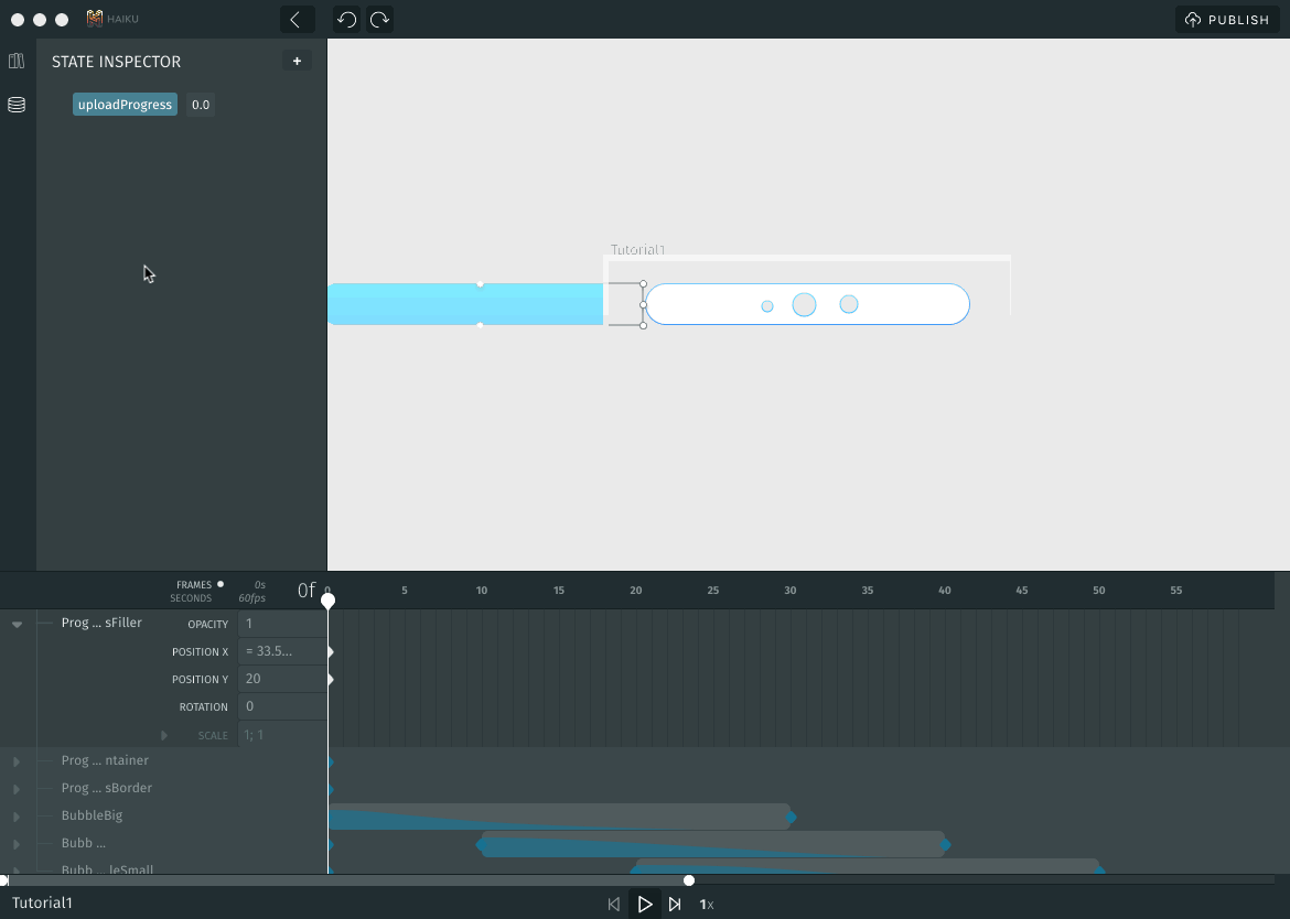
All we did here was change our
uploadProgressstate from0.0to0.5, that is, halfway complete. Since our element jumped to about halfway, we know we got our expression math right. (Also: There's a lot more to learn about expressions in our Expressions guide.)
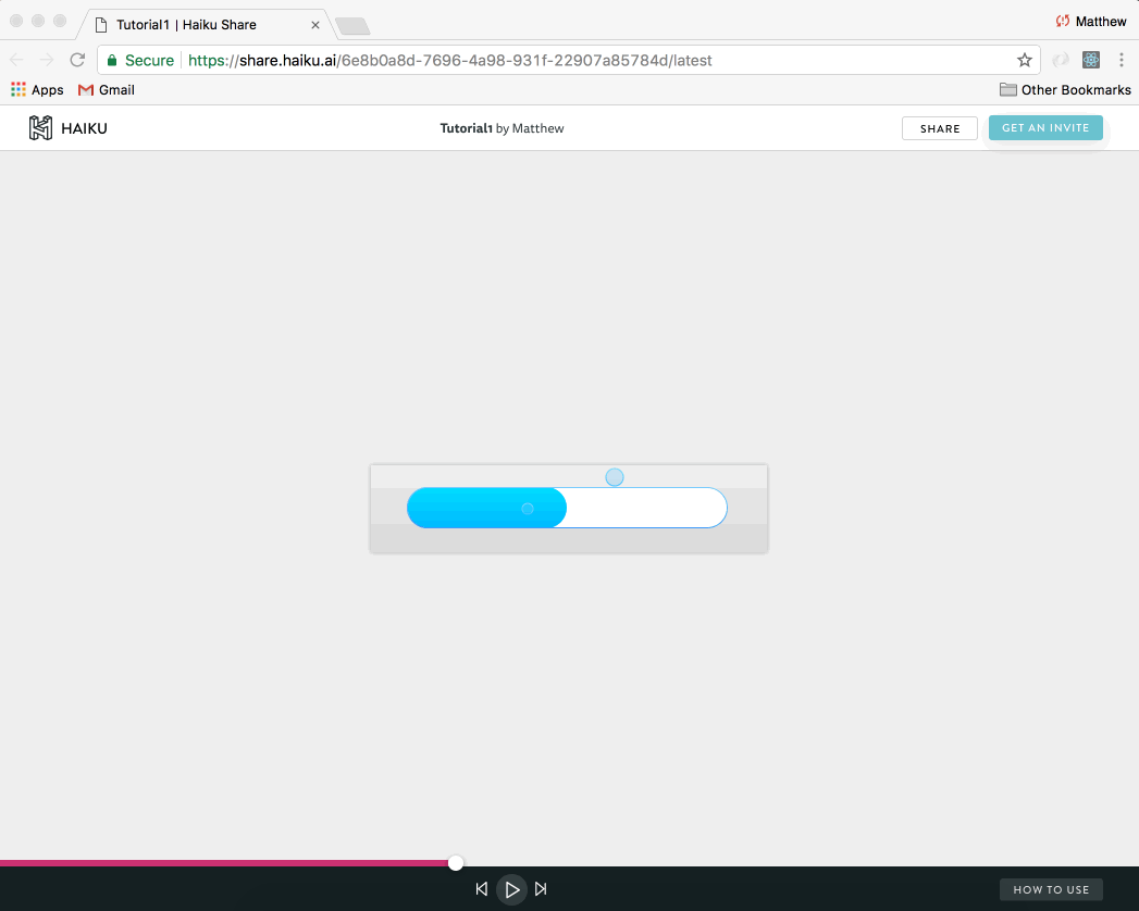
Part VI: Publishing with Animator & Grabbing the Share Link
We now have a nice-looking dynamic component which is ready to be added to our team's file upload React app. The next step is to publish the component and grab a small snippet of code to embed the component in our React app.
First we click the Publish button (at top right) to publish the component:
Wait for several moments, and soon we'll receive a share link, which points to our component's share page, which displays our playable component and provides snippets of code for embedding:
Since our host app is built in React, we'll grab the React code snippet, which looks something like this:
import Tutorial1 from '@haiku/MyTeam-tutorial1/react'
render() {
return (
Part VII: Embedding Your animation
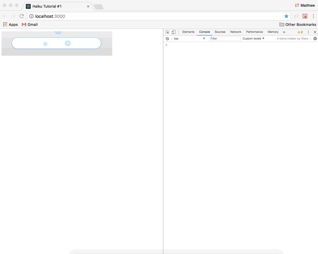
At this point, the engineer is probably getting ready for the painstaking work of converting yet another static design into HTML, CSS, and JavaScript. ...But to her surprise, you say:
"Hey engineer, please use the Haiku CLI to run $ haiku install Tutorial1 in the React app project. Once that finishes up, use this code snippet to embed the component I made in Animator!":
import Tutorial1 from '@haiku/MyTeam-tutorial1/react'
Note: You'll need to replace
MyTeamwith your own team name!
The engineer then sets things up as instructed in the React app, and voilá:
It looks pretty good... (At least, it's a start!)
To see the code for the finished React app, clone the repo and check out the
finishedbranch.
Part VIII: Finishing Up
Now that your app is published and embedded, it's up to you to refine it and take it the rest of the way to be a design that you and your team can be proud of.
If you want to make more design changes, make them in Sketch while Animator is running, and the changes will be merged in seamlessly. When you're ready to push them to production, just Publish again, and tell your engineer that a new version of the component is ready and it's time to run $ haiku update.
If you want to add more programmatic behavior, check out our Haiku Developer API which an engineer can use to add complex business logic to any component.
In Closing
There's a lot more you can do with Animator — this is just an introductory tutorial to give you the sense of the kind of things you can create.